
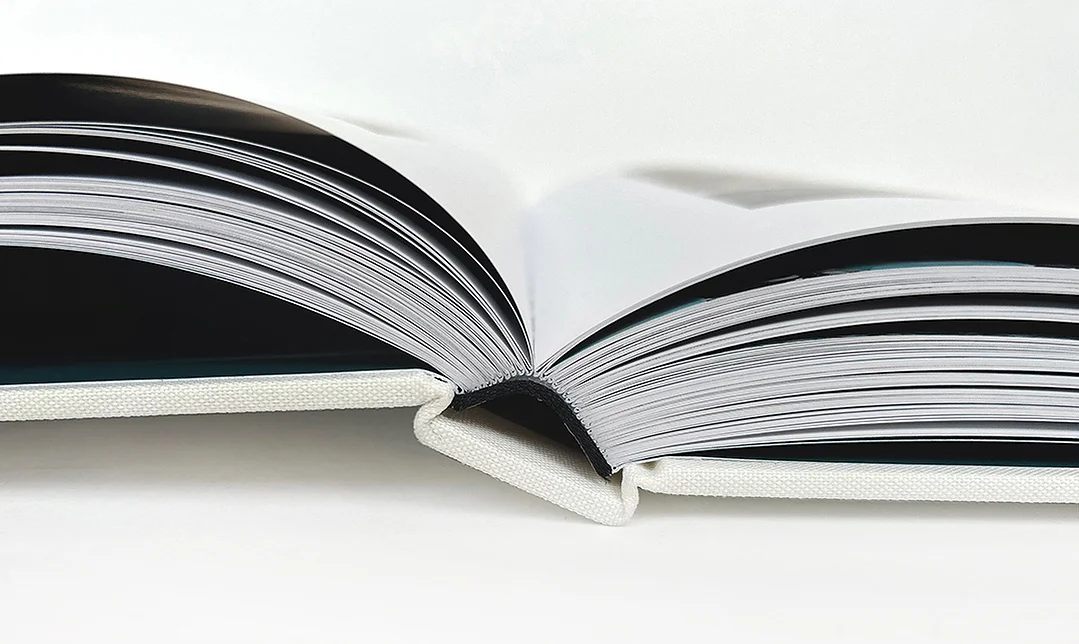
Every visual decision carries a reason. Together, they give the book structure, meaning, and coherence. Beneath each choice is a single guiding principle: serve the story and honour the original intention.
Material as Language
Paper is not simply a surface.
It carries weight, texture, and tone. Each one shaping how the work is received before a single image registers. A smooth coated stock renders photography with precision and clarity. An uncoated sheet, warm and textured, allows imagery to settle and breathe.
Linen, embossing, foil, silkscreen. Each finish is considered in relation to what the content demands.
The way a book feels and weighs in the hands matters as much as what appears on the page.
Structure Creates Clarity
Before a single page is laid out, there must be a vision for sequence.
What opens the book? What is held in reserve? Where does the pace slow, and where does scale expand? Editorial structure determines how a story unfolds. It controls rhythm. It carries the reader from one page to the next with intention.
A well-structured book does not announce itself. It guides.
The Weight of Detail
Margins, spacing, typography, pacing, these are the decisions that go unnoticed when executed well. Yet their presence is always felt.
A shift in scale changes perspective. A turned page builds anticipation. Restraint, used at the right moment, carries more weight than abundance. Every detail is chosen deliberately, in service of the whole.
Beyond Aesthetics
At this level, design is not decoration. It is precision. It is clarity. It is the difference between a book that is admired and one that endures.
When every decision is considered, materially, structurally, editorially. The result is a book that holds together completely. One that communicates with authority, and remains meaningful long after it is first opened.