
PRINT Creative Director Camille Dubois collaborates with artists and estates to create bespoke monographs that commemorate their work, from sculptors to photographers. Below she shares her experiences and what sets these creative collaborations apart.
Throughout my career, I’ve worked with artists to translate their portfolios to the printed page. As a fellow creative, these projects particularly resonate with me. From exhibition catalogues to hardcover 200-page statement books, my directive is to preserve artistic integrity while reimagining a portfolio of artwork in a completely new medium.
The monograph is a distinct experience from the artist’s work, regardless of their medium. The book itself not only displays his or her opus but also becomes a new artwork in and of itself.
A living legacy
My work with living artists affords me unparalleled insight into their worlds. I am always inspired by hearing a visionary discuss their work, techniques, and materials. Speaking with them enables me to get a sense of the artist beyond his or her portfolio: a firsthand look into their personality and how it shapes their creative expression. When designing a monograph, I seek to create a book-object that embodies the artist and resonates with both their personality and relationship to their craft.
When working with artist Donald Robertson, known as the “Andy Warhol of Instagram,” on SOFA KING GREAT, I wanted to create an illustrated book that captured his sense of humor, which is central to both his art and his personality. To communicate this, we chose to present horizontal works over printed backgrounds, juxtaposing bold colors and patterns and leaving little to no white space. The book’s jacket is a playful detail that captures Donald’s whimsical nature: the reversible cover gives readers the chance to choose their own look that best suits their space.
At PRINT, each book is as unique as its author. When designing photographer Natalie Obradovich’s Italian Summer and French Summer, we communicated her classical artistic vision by displaying her images in a traditional design. The layout mimics that of a minimalist exhibition—full bleed images that invite the reader to get lost in her sun-soaked, idyllic beach scenes, and photos set against a simple white page.
Honoring an oeuvre
The experience of designing a monograph varies widely when working with an artist’s estate or family. This is a nuanced process where I make the most of my art director experience: working carefully with their estate or next of kin to determine their most significant works to include, establishing a look and feel that is aligned with their aesthetic, and most importantly, capturing the artist’s work and legacy accurately.
At Assouline, I designed Guy Bourdin: Image Maker, a compilation of the Surrealist artist’s revolutionary late 20th century fashion photography. Working closely with Guy’s son, Samuel, I was fascinated by the experience of discovering the work of an artist through a close relative’s eyes. I could feel the reverence and respect that Samuel held for his father as well as his desire to share his own memories and interpretation of Guy’s legacy.
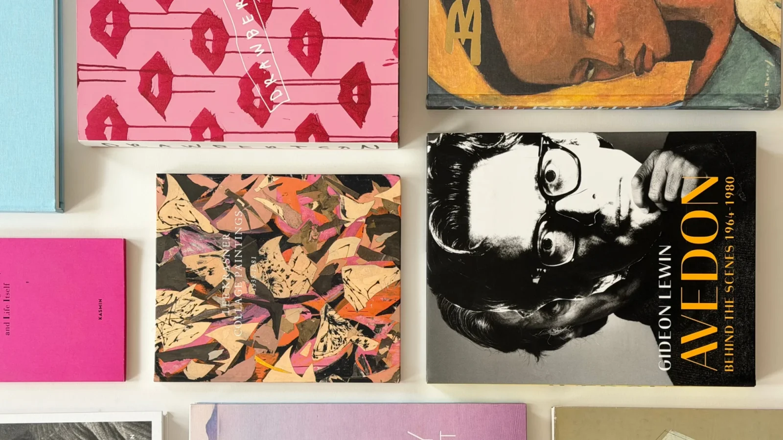
While working with powerHouse Books, I had the opportunity to work on a book with Gideon Lewin, master printer and longtime assistant to acclaimed photographer Richard Avedon. To design Avedon: Behind the Scenes, 1964-1980, I spent days alongside Gideon in his New York studio, sifting through his prints on the floor. Gideon provided a new way of experiencing an artist’s legacy, offering a behind-the-scenes look at the man behind the lens. While Gideon himself was not the artist, he was an essential part of Avedon’s process from the mid-60s through the ’80s, sharing never-before-seen images and stories of collaborating with the renowned fashion photographer.
Translating artwork to paper
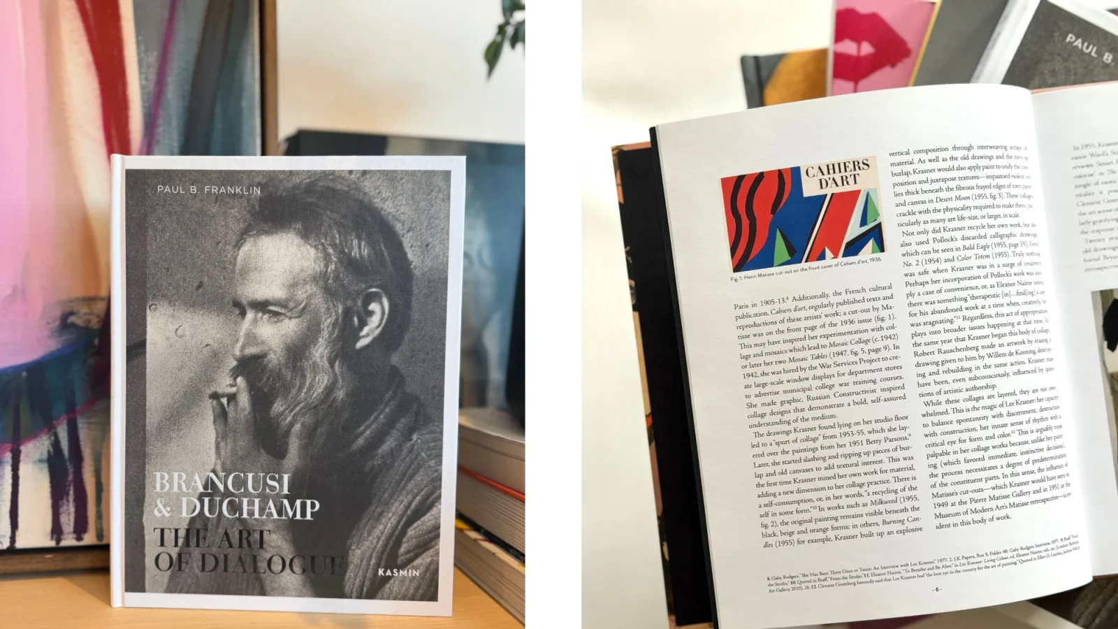
When reimagining an artist’s collective body of work as a singular physical object, we consider format, context, and the reader’s eye. The way the artwork is displayed—its size on the page—must reflect the intention of the work and its maker. At times, we choose to communicate their stories in an unexpected way: including an artwork that is not as significant to the artist but is impactful to their oeuvre as a whole or a close-up of a painting that emphasizes their brushwork.
Resting in the reader’s lap, the monograph offers an intimate, interactive view of the artist’s work and the opportunity to showcase details that may otherwise seem minute.
The art of the monograph
A book is not only something that contains, displays, and pays homage to an artist’s work. It provides a different experience of their portfolio. The reader flips through it, starting from whichever page they choose, and can return to the book time and time again. It is an honor and delight to work in such close proximity to these celebrated creative minds. I am grateful for the opportunity to provide a new lens through which to understand their artwork and career.
To learn more about PRINT / The Book Agency’s work, explore our art books and exhibition catalogues as well as our photography and design books.