
It is not easy to imagine a world without paper. From reading the morning news to unwrapping a package, it is a material that is deeply ingrained in our daily routines. First invented in China during the Eastern Han period in 105 AD, paper remains a cornerstone of communication. Yet, despite its status as an essential, it is often overlooked.
When we are asked to imagine paper, our minds often conjure up a single blank white page. Often treated as the invisible carrier of culture—an empty canvas intended to melt away and showcase the words, illustrations, or images printed on its surface—today, contemporary artists, luxury fashion houses, and bookmakers are increasingly urging us to consider paper as an artwork in and of itself. With its wide range of applications, hues, textures, and endless foldability, paper is one of the world’s most versatile mediums.
The everyday as art
One of the first art movements to consider paper as a compelling medium was Arte Povera. Italian for poor art, this movement began in the late 1960s and centered around the use of utilitarian materials. Artist Janis Kounellis swapped the traditional painting canvas for newspaper, Alighiero Boetti transformed grid paper and stamped envelopes into art, and Giulio Paolini created conceptual sculptures centered around whole and torn sheets of white letter paper. While highly regarded amongst the European avant-garde, these artists and their choice of seemingly “worthless” mediums puzzled the public. It was not until the ’80s that Arte Povera gained respect. Cited as one of the most influential movements in postwar and contemporary art, today Arte Povera works can be found in major institutions worldwide, from the Tate to the MoMA.
Paper as sculpture, not surface
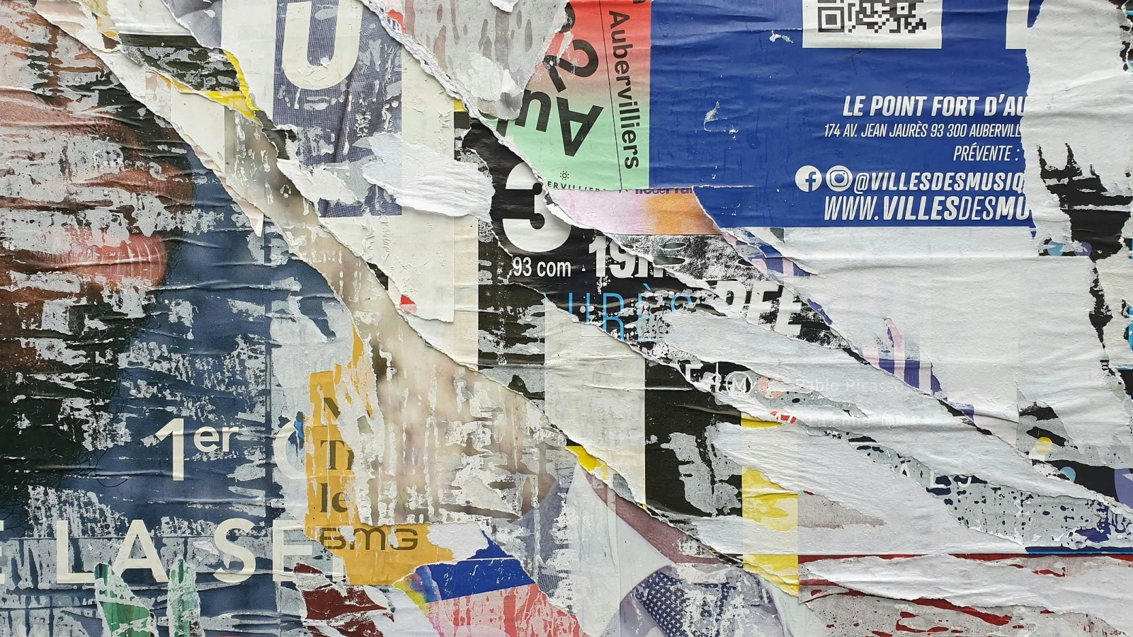
Arte Povera paved the way for today’s artists to consider paper as a worthy medium. While Kounellis, Boetti, and Paolini all used paper, it remained a two-dimensional material reminiscent of its everyday applications. Contemporary artists expand upon its use, taking its malleability to new heights and stripping it of its everyday connotations.
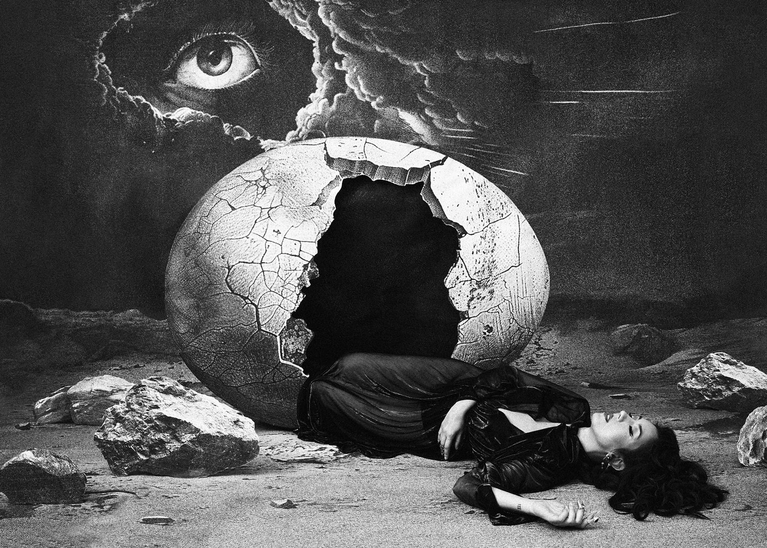
Multi-media artist Jana Frost brings paper to life by creating immersive worlds through collage. The London-based artist’s installations are composed of black-and-white collages assembled from scanned imagery from archives and libraries that she prints at home on A3 paper. Frost blurs the boundaries between the real and imagined, photographing and filming herself placed within her larger-than-life dream-like installations. Her artworks’ intricate, black line illustrations feature surrealist motifs and are reminiscent of M.C. Escher and Fornasetti. The environments she creates look as though they are expertly crafted theater sets, and the delicate nature of the material impossible to decipher.
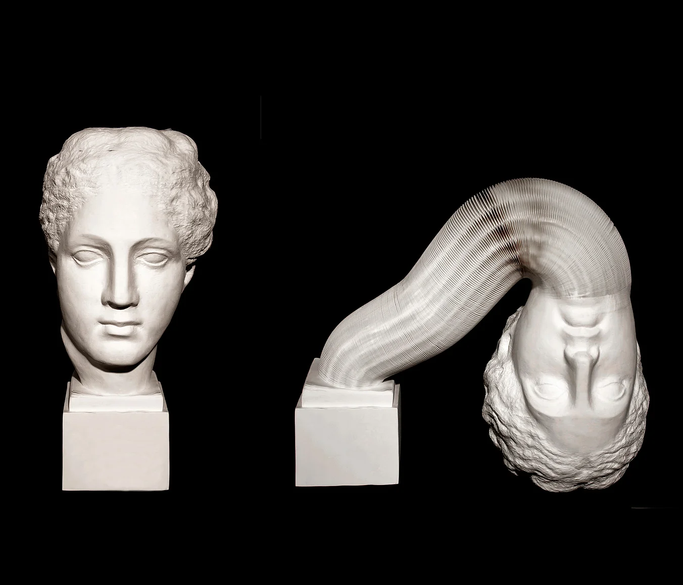
Like Frost, contemporary Chinese artist Li Hongbo also takes a three-dimensional approach to paper, reinventing the material’s form and challenging viewers’ understanding of its applications through a more traditional fine art approach. Hongbo’s work includes kinetic sculptures, busts, and large-scale installations featuring a variety of paper, from newspaper to bright hues. As with Frost, Hongbo encourages the viewer to view paper in a new light, breaking the boundaries of what can be achieved with the medium, and crafting objects and installations that do not appear to be made of a fragile, everyday material.
From utility to luxury
The use of paper as a high art medium has even expanded beyond the gallery, appearing in one of the most unexpected places: the windows of renowned fashion houses. In the age of Instagram and the attention economy, visually arresting retail displays have become more important than ever. French fashion house Hermès has a long legacy of elaborate window décor and garners much attention for its partnerships with emerging artists. For over a decade, the brand has worked with French paper artist duo Zim&Zou to create one-of-a-kind sculptural window displays constructed completely out of paper. Reminiscent of the vibrant patterns of the maison’s silk scarves, these textured scenes range from lush foliage to city skylines, often highlighting Hermès’ signature equestrian iconography. Self-proclaimed “paper pirates,” Zim&Zou make artwork with a fantastical sensibility—for example, using magnets to create the illusion of floating sculptures—and provide a much-appreciated sense of whimsy to a historic fashion house that could otherwise be viewed as serious and unapproachable.
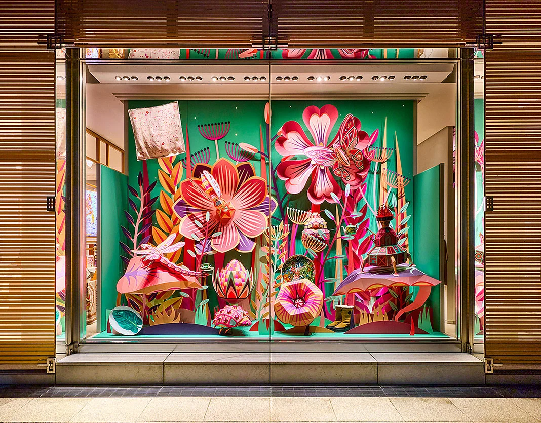
Renowned for its craftsmanship, legacy, and use of luxe materials such as rare animal skins, leather, silk, and gold, Hermès is an unexpected patron of paper arts. By showcasing Zim&Zou’s work in multiple storefronts from Beverly Hills to Tokyo, Hermès succeeds in elevating paper to a luxury good worthy of reverence. The medium is positioned as a high-end material that complements Hermès’ highly coveted handbags, silk scarves, shoes, and accessories, codified within the language of luxury.
Beyond the white page
Bookmaking is one of the oldest applications of paper. An ancient object that first became an artistic relic in the Middle Ages, today illustrated books are an essential for telling visually-driven stories. At PRINT, we encourage our authors to consider the hand of the paper: its tactile qualities and what emotions are evoked when a reader flips through the pages. The choice of paper stock, coating, finish, and book binding all impact the reader’s experience and offer an opportunity for an author to communicate their point of view beyond imagery and text.
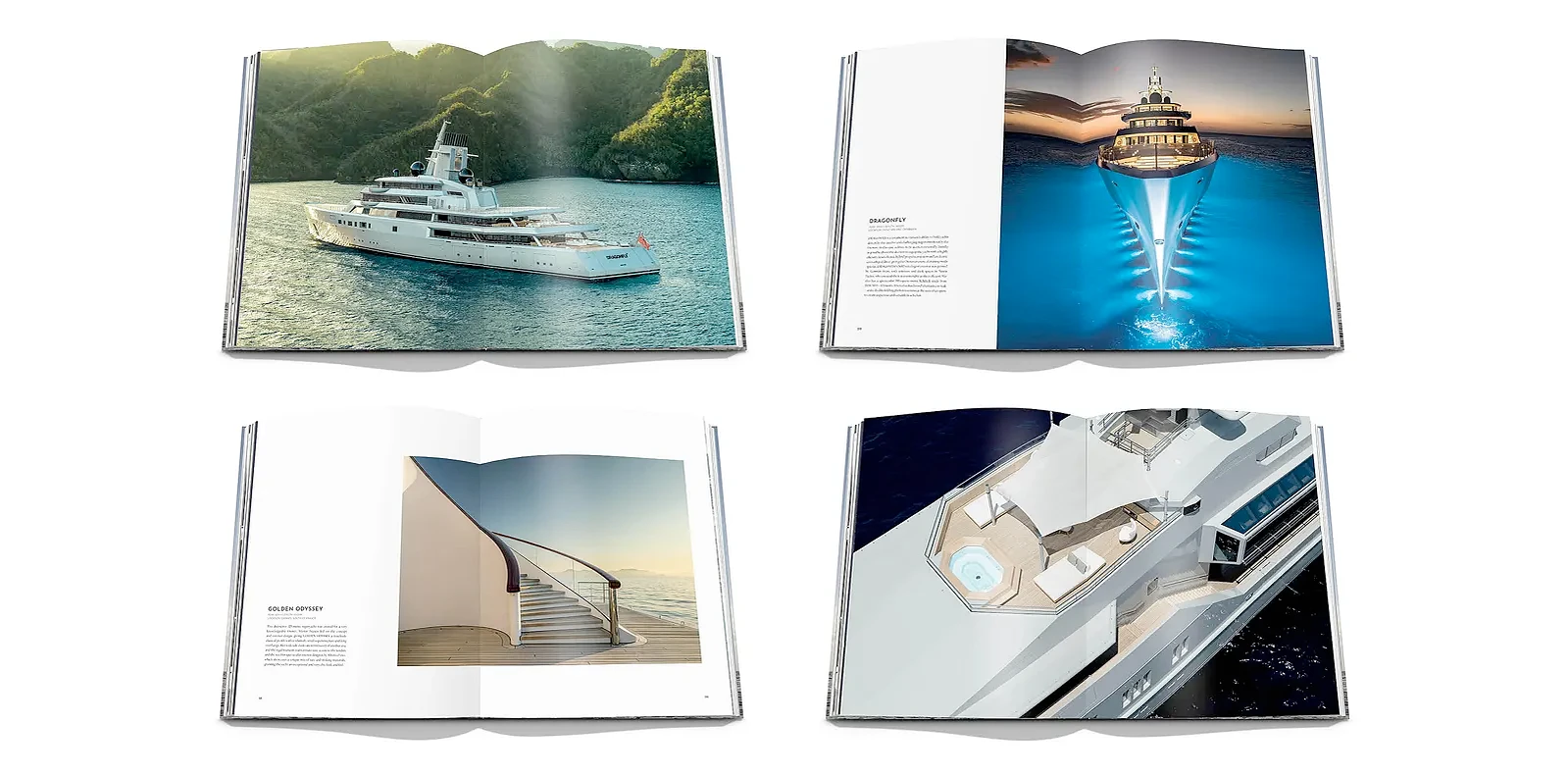
Paper is not only a vehicle for the book’s words but also an extension of its narrative. When designing Lürssen, we were tasked with creating an illustrated book that captured the family-owned superyacht company’s 150 year anniversary. In honor of this milestone, we chose two different kinds of paper to create a dialogue between the past and present, juxtaposing text on warm, off-white uncoated Italian paper with photography printed on matte art paper. The result is a one-of-a-kind large-format publication that conveys Lürssen’s rich heritage while remaining modern.
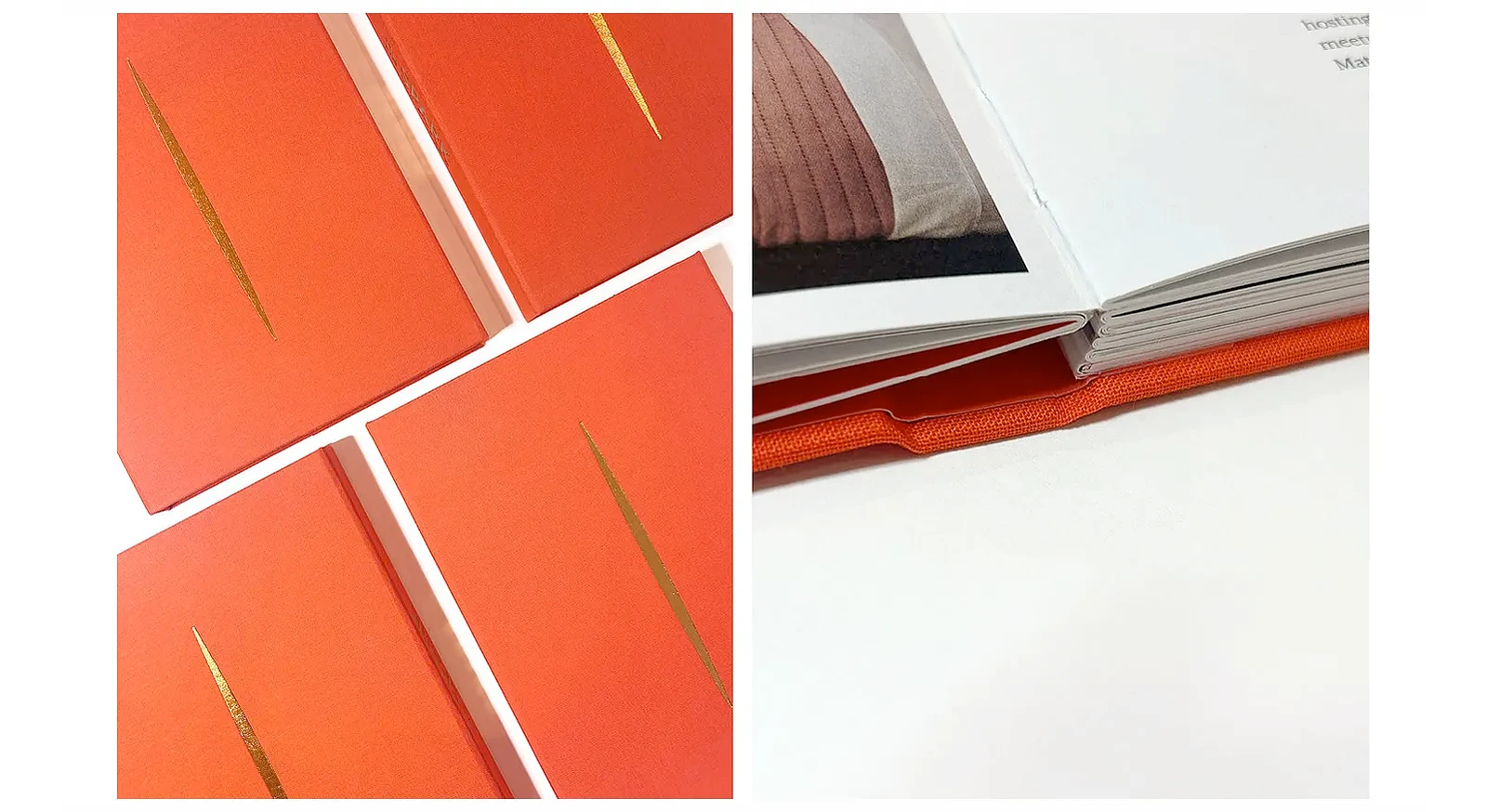
When designing SPARK: Portraits of Purpose, we were challenged to create a commemorative book honoring eleven technology-driven non-profit start-ups shaping change. To create a gift-like tome that invited connection between those holding the book and those depicted within its pages, we selected a bright white soft matte paper that toes the line between a coated and uncoated page. The book’s binding is exposed so that those leafing through SPARK can see the glue and stitching that holds it together. The resulting book is a publication that marries contemporary and raw elements, both of which emphasize the paper’s materiality.
The beauty of obsolescence
With the rise of digital media, we have seen the deprioritization of physical paper objects such as books, notebooks, newspapers as readers reach for their screens. By placing paper front and center and demonstrating its many applications, contemporary artists, major fashion houses, and luxury bookmakers are encouraging us to reconsider this humble household material. In doing so, they prove that paper no longer has to be confined to the surface of an artwork, but can be the artwork itself: a material worthy of craftsmanship in its own right.